Before we announce the winners of the 2015 MyTheatre Awards, we’re proud to present our annual Nominee Interview Series.
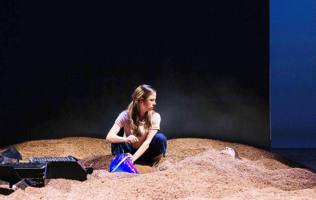
The creative Outstanding Design nominee behind one of this year’s Best Production candidates, Shannon Lea Doyle worked with sand to reinvigorate an old text for Praxis Theatre/FeverGraph’s physical reinterpretation of Caryl Churchill’s demanding Objections to Sex & Violence.
Can you remember the first theatre production you ever saw?
Yes! The Mousetrap in Toronto.
How did you get into designing?
I began making collectively created theatre with friends I met in Soulpepper Theatre’s Afterschool Program while in high school. Later, people in that expanded network started directing plays and asked me to design, assuming I could because I was a sculpture student at OCAD University.
What was the first show you ever worked on?
A one woman show titled i written and performed by Cassandra Walker and directed by Virgilia Griffith at Tarragon Theatre’s backspace.
How did you get involved with Objections to Sex and Violence?
Some of the artists on the project had seen my design for Seams at SummerWorks Performance Festival and got in touch with me through mutual colleagues.
Tell us first about developing the design concept for the show. What were some of the things in the script that inspired you most?
The team spent our early meetings thinking about the context of the play in Caryl Churchill’s oeuvre. Coming together outside of the group discussions Michael (director) and I asked each other many questions that we then answered through the formation of our concept: What does Jule’s bathing suit do to us? What is the fire? Historical research was a vital parallel conversation; we worked with an excellent young director (Zoe Erwin-Longstaff) who illuminated the facts of car bombings taking place in Britain. These car bombings became an important visual reference. A key to the work was the rising tide mentions Churchill in the setting descriptions. I imagined the qualities of the sea as a large black wall that moved several feet forward to begin act two, pushing the “sand” that covered our playing space to create a new physical depth and compression.

The set was so stark but also so textured at the same time. What inspired that contrast?
Michael spoke of Jule as a supernova star which I believe inspired our actors and sound designer Thomas Ryder Payne, whose soundscape then in turn influenced my collaboration with lighting designer Kaileigh Krysztofiak in the creation of “rocks” that became lighting accents. The play takes place on a beach so the texture of sand was a given. The dark glossed surfaces were my interpretation and merger of the feeling looking out to sea and the charred metallic wreckage of cars that had been bombed. It was later in the rehearsal process that I really heard the lines about oil on the beach and then began thinking of the black floor under the sand as oil and about the play’s potential to reference human affects in relationship to American oil spills. A shared inspiration for Michael and I was the starkness, compression and arrangement of space in Jan Versweyveld’s design of A View From the Bridge.
What were some of the technical challenges of the design?
There were two major challenges: building “rocks” that house lighting fixtures and are sat on by actors without being able to afford the skills of a carpenter, and making it easier for two (really lovely) actors to push a ten foot wall with piles of cork in front of it six feet across the stage.
Were you pleased with how the design worked in practice?
Yes, I was!
Do you have a favourite moment from the production?
I very much like the physical state of the opening sequence where Jule walks along the beach, I think it was a great introduction.
What are you doing now/ what’s your next project?
I think my favourite is often what I am currently working on! At the moment I am very excited to share The Just by Albert Camus, directed by Frank Cox-O’Connell at Soulpepper Theatre in Toronto.

