 Before we announce the winners of the 2014 My Theatre Awards, we’re proud to present our annual Nominee Interview Series.
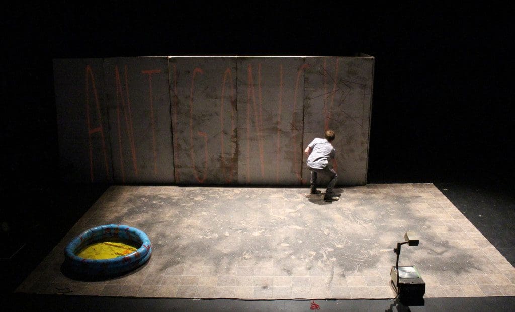
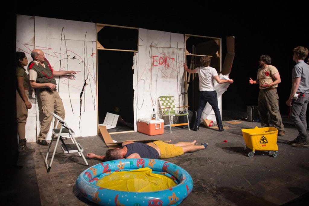
Generally a festival production features a fairly simple set (or a non-existent one), something cheap to construct and easy to strike. Antigonick at SummerWorks didn’t feel at all like a festival production. It felt like a larger enterprise, something in residency at the Theatre Centre with a team and a budget to facilitate its theatrical ambition. Best Design nominee Reid Thompson is a lot of the reason that’s the case, giving the characters a complex and thoughtfully designed space to live in and destroy over the course of every high-octane performance.
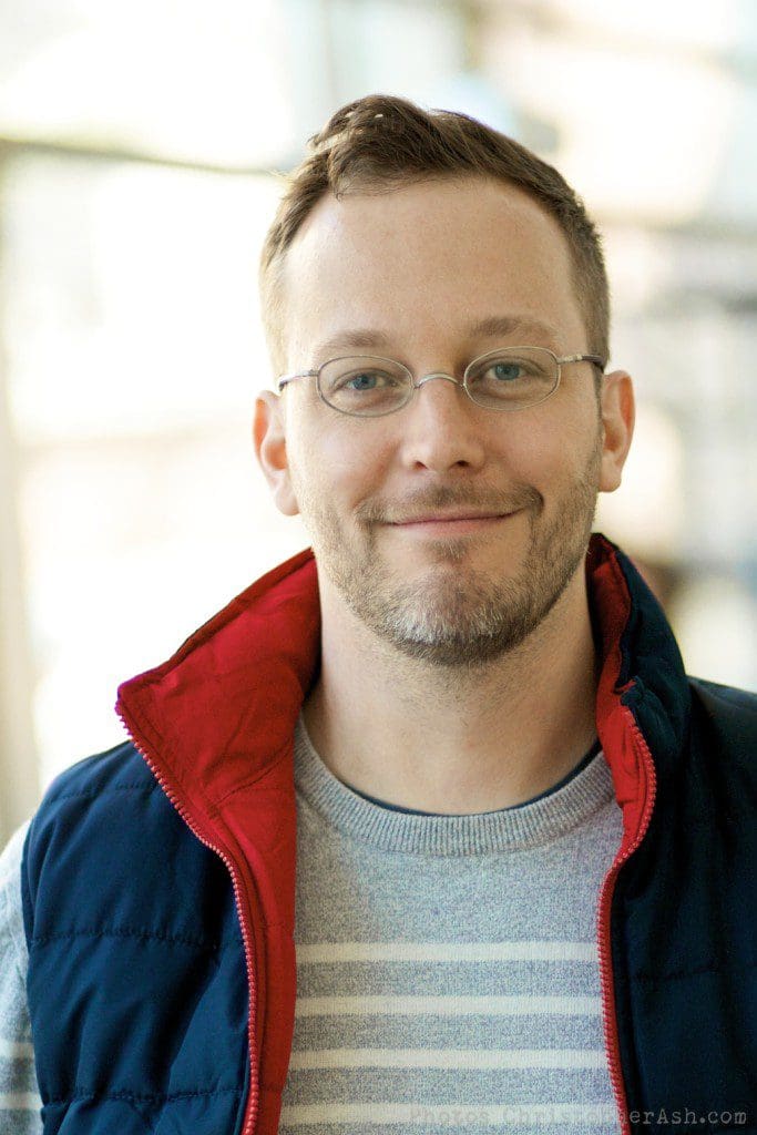
Reid joins the Interview Series from New York to reminisce about SummerWorks and Antigonick.
 Can you remember the first theatre production you ever saw?
Gosh – something silly like Cats or Les Miserables on Broadway. It didn’t make a very big impression on me. I remember it feeling stilted and mannered and fake -though I didn’t have those words at the time. I was much more taken with the local production of The Nutcracker – that seemed magical!
How did you get into designing?
I did my undergrad degree in fine art, and painting was my raison d’etre through my young adulthood. To make a living and pay for my studio space I was working as a scenic artist painting scenery in New York City; though I had raised through the ranks to work on Broadway shows and for the Metropolitan Opera, I still thought of it as my day job. Working in the scene shops I started getting curious about the shows coming through; I started to go see them. That’s when I fell in love with opera and started to see everything – opera, theater, dance, weird downtown stuff – I couldn’t get enough. And concurrently I was getting asked to design small shows for friends – although I had little experience, they trusted my eye as an artist. I found it so gratifying that I decided to go back to school to get formal training and an MFA at the Yale School of Drama.
What was the first show you ever worked on?
First show I ever did a set for? In my twenties I did A Midsummer Night’s Dream with some friends of mine who run a High School theater program. I didn’t know what I was doing so I took a lot of chances – just did whatever felt right. It was wild! My friends were kind and trusting and the kids were great. Looking back on it, I was as fresh as they were.
 How did you get involved with Antigonick?
Cole Lewis, the brilliant director of Antigonick, was a frequent collaborator of mine at Yale. She had been talking about this play forever so when she approached me about doing it in Toronto I jumped at the chance.
Tell us first about developing the design concept for the show. What were some of the things in the script that inspired you most?
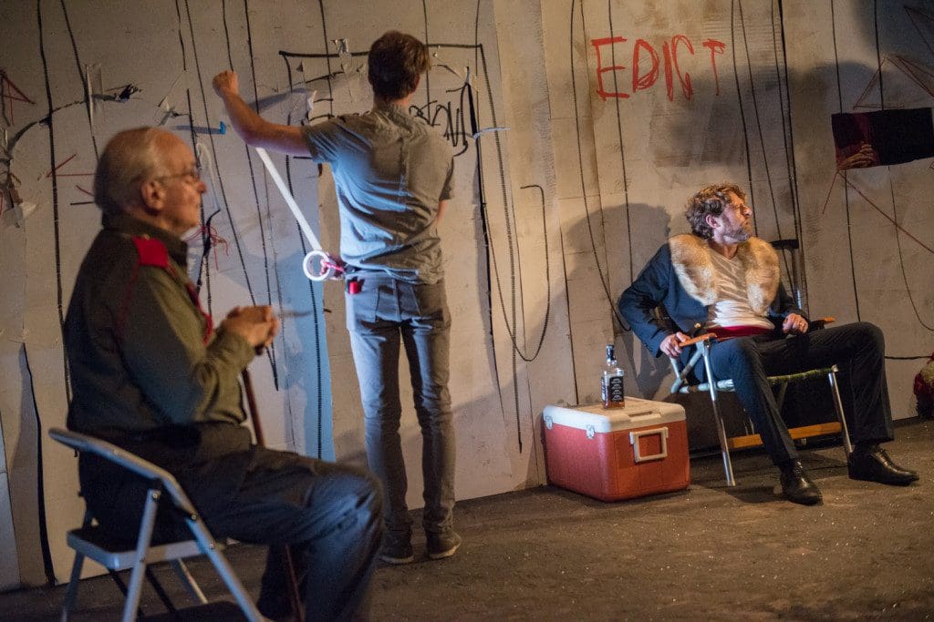
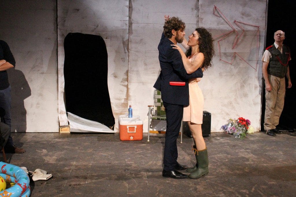
The book itself – the object – was a huge influence on the design. Anne Carson had conceived of her translation/adaptation of Antigone as a book; she hand lettered the pages, heightening her translation with mysterious melismas and gaps and occasional words in red. She also worked with illustrator Bianca Stone who produced illustrations on vellum that overlap the words. The illustrations are seemingly unrelated to the text – they are Stone’s poetic response to it. We wanted to evoke the experience of the book in our production – hence the white walls getting drawn on, with the projection images overlaying them. Beyond that we kept circling back to dust, to sand, to a place on the frontier of things. Cole brought us the idea of a contemporary wild west/frontier, a place with the detrius of a suburban backyard. And we took that and ran with it.
 What were some of the technical challenges of the design?
Well, the festival setting was a challenge – striking and setting it up in the time alloted (I think 20 minutes) was an everyday miracle. The stage manager and the cast were incredible in making it happen through the week-long SummerWorks run. Also the space that was available for storage in the theater was tiny – 3 x 4 feet- so the whole thing was stacked like a skyscraper to the ceiling! In addition to that the cardboard had to be changed out with every performance and reattached to the flat frames – I think we went through 85 sheets of 4′ x 8′ cardboard. One of our cast members had a father who ran a cardboard factory – what are the chances? So we got all the material donated though his generosity. I had an awesome TD [Technical Director] who built all the flats and painted the cardboard – and the can-do attitude of the cast made it possible. But I was sweating each time!
Were you pleased with how the design worked in practice with so much character interaction involved with the entrances and exits?
Absolutely. We had been inspired by the work of Dmitri Krymov – especially his Opus #7. He has actors cut through cardboard walls in that piece and we borrowed the idea from him. I loved the way Cole and the actors took the idea and ran with it. Much of it was improvised in the moment – there was no predicting or controlling the shapes that they created and they changed as the production went on. Sometimes as a designer you just cede control; you give an actor a knife and point at your set. Chaos principle.
 In a festival like SummerWorks you need to be able to set up and strike quickly. With one of the most complex designs of the festival, how did the practical realities of SummerWorks factor into your work?
Well – Ignorance is bliss. I had gotten the information packets and Cole explained the rules but, because I had never been to SummerWorks or anything like it, I was kind of oblivious to the nutty pace. So we just designed what would work well for the show, and made sure it could be taken apart and cleaned up quickly. I am very comfortable with that sort of guerrilla theater from the Yale Cabaret, where a production is thrown up and closes in a weekend. So it didn’t seem scary. Plus I had great support – a great TD and director who isn’t afraid of big ideas. And a group of actors who were really hardworking and easygoing. So we just went for it. Why not?
Do you have a favourite moment from the production?
I think the first time Kreon cut through the wall – the surprise of it. I also loved when Cole had Kreon and Antigone dance. I thought that was brilliant. And there was one moment – a choral ode – where all the chorus was looking off into the abyss stage left after Antigone had been taken to her death – Joe Lapinski, the sound designer had this windchime type sound and it was the most surprising and pitch perfect emotion for that moment. Both Cole and I had taken a directing course at Yale with Robert Woodruff – a legendary American avant-garde director. He said one of the best things you can do as a director is hold something too long – maybe way too long – or too short. And with those windchimes that “too long” was perfect.
 What would you say is your top priority (either artistic or practical) in any design project?
Support the play. Support your director’s vision. The practical needs of the production but also the emotional needs of the production. And the rest you can figure out. Get that right – and don’t be afraid to try things that seem odd or crazy – and the rest will fall into place.
I remember the first time I put a working clock on stage – you are told in design school that this is verboten because the audience won’t be able to concentrate on the story when confronted with the reality of time – and everyone loved it! It was in every review, that clock. Because it supported the story and supported the emotional feeling of the play. So it was right – and the rule was wrong.
What’s your favourite design you’ve ever worked on?
A terrible question! You can’t ask a father to choose amongst his children. Seriously – every show has highs and lows. The ones that stick in my mind are the ones where we took a big risk and it paid off. I also love the controversial ones – where half the audience walks out and the other half raves about it.
What are you doing now/ what’s your next project?
I have 3 opera projects coming up in the next months. A rarely performed Offenbach pastoral operetta, Daphnis & Chloe, a spiky modern music masterpiece, Kurtag’s Kafka Fragments, both in New York, and a grand Baroque opera, also rarely performed; Cavalli’s Erismena in New Haven. A big classic American musical and a new play this summer (a reunion with Antigonick director Cole Lewis) round out the season!
Do you have anything you’d like to add?
I found Toronto to be warm and welcoming for us American theater artists – you have a great community up there, open to new ideas and new interpretations. I look forward to coming back to visit and to see new work.

